webdev-prework-track
CSS Grid

In tandem with CSS Flexbox, grid denotes a bright new(ish) future to webpage design and scalability. Whereas Flexbox is a one-directional layout system, grid is “two-dimensional”, meaning that the contents of a page can be more formally structured by designing an overall “layout” of a page and placing those contents within it. The concept, like Flexbox, is dependent upon the idea of containers and items, but the behavior and terminology is slightly different.
It’s worth noting that Grid and Flexbox are both widely utilized, and it is considered good practice to use them together in designing your webpage. As a general rule of thumb, grid will be used for high-level page structuring.
That being said, let’s get into it.
Terminology and Basics
There are a number of terms that, despite their similarities, are used to describe very specific aspects of a grid layout. They are:
- container
- item
- line
- cell
- area
- track
Let’s go through them one at a time:
Grid Container
Like in flexbox, the container is an element with the CSS display:grid assigned to it. This element will contain the items that will be oriented based on the properties assigned to the container, like number of columns and rows, their height, etc. Containers are where the majority of structuring is defined. More on this later.
<div id="container">
    <div class="item">item</div>
    <div class="item">item</div>
    <div class="item">item</div>
    <div class="item">item</div>
</div>
#container {
    display:grid;
    /* Additional properties assigned here*/
}
Grid Item
Grid items are the elements that exist as immediate children of a grid container. They are the elements that will find their home within the container, and will be moved around and adjusted relative to that container. Grid items have properties available to them simply by virtue of being children of a container.
<div id="container">
    <div class="item">item</div>
    <div class="item">item</div>
    <div class="item">item</div>
    <div class="item">
        <div class="item-child">Not an item</div>
    </div>
</div>
#container {
    display:grid;
}
.item {
/* grid item-specific properties assigned here*/
}
Note
Like flexbox, grid only goes one level deep; children of items don’t adhere to the same rules as the items themselves.
Grid Line
When a grid is defined, so are the grid lines. These lines are numbered by default to make placing items inside of their boundaries easy and explicit.
Say for example, we define a grid here:
#container {
    display:grid;
    grid-template-columns: repeat(3,100px);
    grid-template-rows: repeat(2, 100px)
}
This grid has 2 properties, grid-template-columns and grid-template-rows. There are a number of ways to define these 2, but here the end result is a grid with 3 columns, and 2 rows, like so:
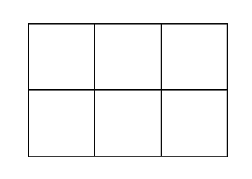
The lines of this grid, then, are numbered as follows:
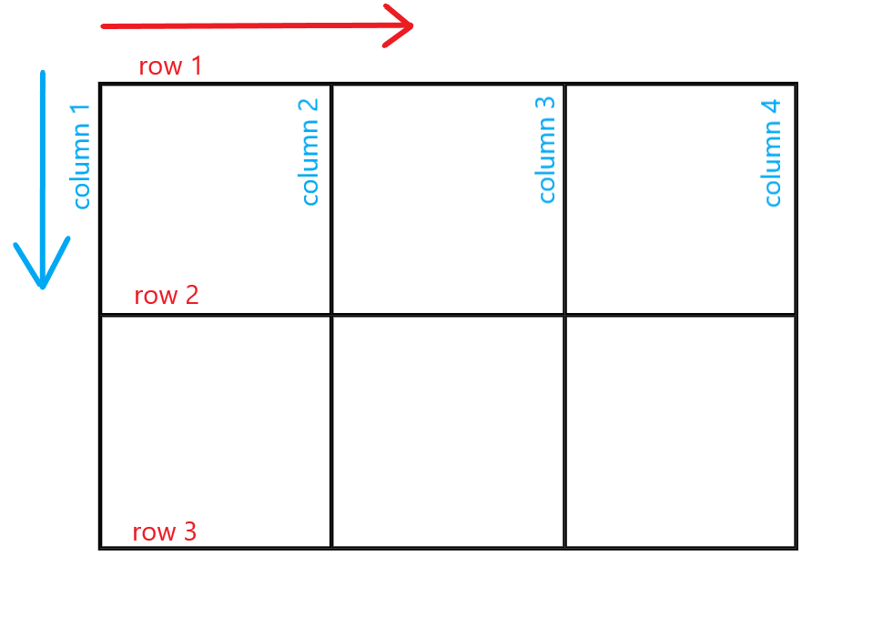
Think of them as coordinates used to outline individual cells of the grid.
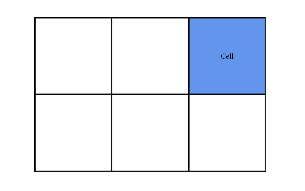
grid cell
A grid cell is the smallest grid unit within a container, and is comprised of neighboring columns and rows. The example below highlights a cell that consists of column lines 3 and 4, and row lines 1 and 2.
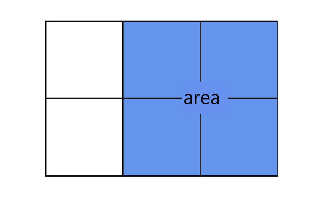
grid area
grid areas are comprised of one or more cells that cover a rectangular section of the grid. They are made when you place an item across multiple lines.
This grid area spans:
column 2 through column 4 row 1 through row 3
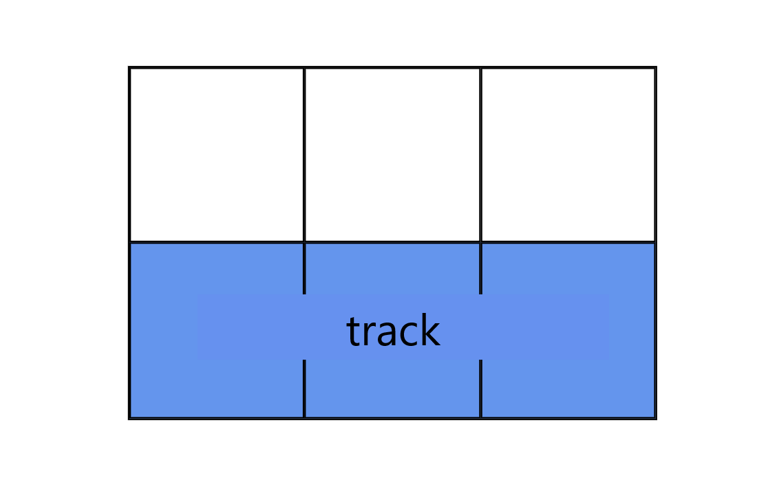
grid track
grid tracks are simply the spaces between two grid lines. They are the stacks or cells that make up your columns or rows!
Shown below is the second row track on this particular grid.
Phew. Now that some basic terminology is out of the way, let’s get into it! First up is where most of the magic happens; the grid container
Parent Container (grid container)
Grid containers can be defined and layed out in a number of ways, all of which revolve around the core concept of defining the number and size of both the columns and rows within it. This is fundamentally achieved with grid-template-columns and grid-template-rows.
grid-template (columns and rows)
As the name indicates, these properties are used to define the template, or overall layout, of the grid. Both properties expect a size, either relative or fixed, that determines the width/height of the track in question. Based on the way this value is applied, these properties may be dynamic or fixed as well.
Let’s take a look at that grid from before:
#container {
    display:grid;
    grid-template-columns: repeat(3,100px);
    grid-template-rows: repeat(2, 100px)
}
In our CSS, the two properties, grid-template-columns and grid-template-rows, are defined with the repeat function that takes 2 arguments: the second being the size of the column or columns to create, and the first is how many times to repeat them.
grid-template-columns: repeat(3,100px);
This is saying, “make 3 100px columns. It is equivalent to:
grid-template-columns: 100px 100px 100px
Sizes separated by a whitespace will have the same result.
You can also, instead of referencing the grid lines by their alloted number, you can name them so later you can place your items in them explicitly:
grid-template-columns: [line1] 100px [line2] 100px [line3] 100px [line4]
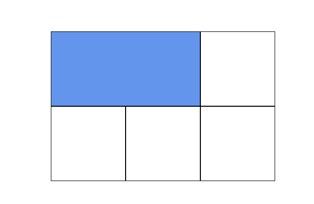
grid-template-area
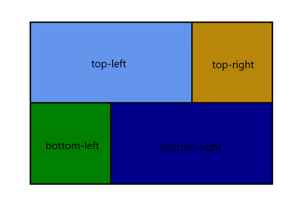
When you define your grid tracks, you can state exactly how you’d like the areas within it to span. You do so very visually:
grid-template-areas:
"top-left top-left top-right"
"bottom-left bottom-right bottom-right";
Take that 3x2 grid we’ve been working with. The template areas that have been defined in relation to the 100px by 100px cells are shown below. Now, it’s as simple as plugging the items into their named areas.
>When using grid-template-area, it is important to understand what it’s effectively doing. By defining these areas preemptively, you may be limiting yourself down the line. Keep scalability in mind! As your page grows, will it adapt, or require a complete reformat of the grid-template-area?
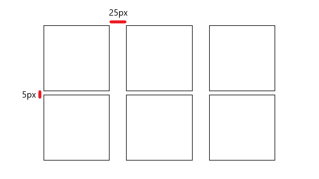
gap
gap, is a useful shorthand for row-gap and column-gap. It takes 1 or 2 sizes that define the space between rows and columns, respectively. These values determine the margin between columns and rows. If the second value is omitted, it will default to given row gap.
gap: 5px 25px;
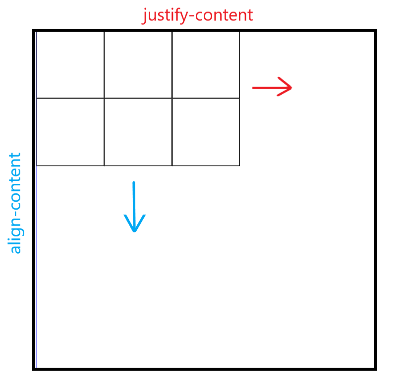
justify-content & align-content
When the container is bigger than the grid you have defined, you may assign the properties justify-content and align-content to specify where you would like the grid to be within the container. This also has the capacity to separate rows or columns in a way that fills the entire container.
Here is an illustration of the general concept.
The properties availalbe for either of these are:
start: aligns item to start edge of their cell/area
end: aligns items to end edge of their cell/area
center: centers the item to center of cell/area
stretch: changes the height/width of the item to fill the provided space.
space-around: fills the container by separating the tracks (row or columns) with equal space on all sides.
space-between: fits the outside items in a track to the container’s edge, and spaces the remain items.
space-evenly: provides an equal distance between all grid items.
Try it here:
justify-items & align-items
These 2 properties deal exlusively in orienting the items within a grid. And, moreso, EACH individual item with respect to the grid area it is currently residing in. Show below are items of varying sizes that can be aligned and justified based upon the values given to the properties justify-items and align-items.
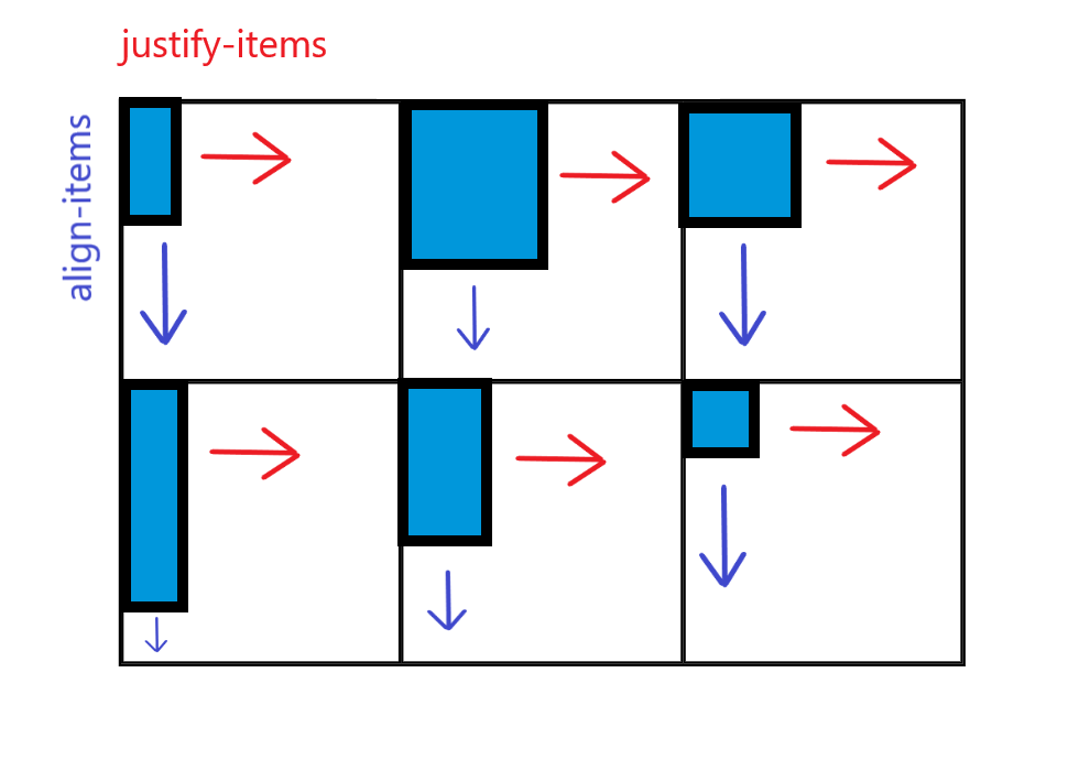
The properties availalbe for either of these are:
start: aligns item to start edge of their cell/area
end: aligns items to end edge of their cell/area
center: centers the item to center of cell/area
stretch: changes the height/width of the item to fill the provided space.
grid-auto-columns & grid-auto-rows
grid-auto sets the behavior for any rows or columns that have not been previously defined. If you were to create a new item and try to place it somewhere other than within the existing grid (or, the grid is full and needs to make room for more,) you would do so with grid-auto-columns and grid-auto-rows. This defines the behavior for additional columns being created.
For example:
grid-auto-columns: 60px;
This is saying that for EVERY additional column needed, have it default to a value of 60px. This will “fill in the blanks,” so to speak, and allow for the grid to adjust accordingly. This is an important property if you expect your grid to grow over time, or are unsure of the number of items that it will eventually hold.
Try it here! See how adding a 7th item to the list causes the grid to behave, and how it goes about remedying this.
Child Container (the grid item)
Now that we’ve taken a look at how best to define and customize a grid container, let’s take a quick look at the properties that are availalbe to grid items themselves. These properties are fewer in number, and explicitly deal with the placement of each individual item both within its area, and the grid’s flow as a whole.
grid-column and grid-row
To move any individual grid item regardless of behavior defined by the grid container, you can give that item the properties that tell it which grid lines it spans across in both column and row.
grid-column-start & grid-column-end define the columns in which an item will reside in.
grid-row-start, grid-row-end define the row in which an item will reside in.
This will look something like this:
<body>
    <div id="container">
        <div class="item item-1"></div>
        <div class="item"></div>
        <div class="item"></div>
        <div class="item"></div>
        <div class="item"></div>
    </div>
</body>
#container {
    display: grid;
    border: 1px solid blue;
    grid-template-columns: repeat(3, 100px);
    grid-template-rows: repeat(2, 100px);
}
.item-1 {
    grid-column-start: 1;
    grid-column-end: 3;
    grid-row-start: 1;
    grid-row-end: 2;
}
This will result in, as seen before, a 3x2 grid. Then, when item-1 is given the proper start and end values as shown above, you’ll get something like so:
This can be achieved with the shorthand property grid-column and grid-row:
    grid-column: 1/3;
    grid-row: 1/2;
grid-area
grid-area is the corresponding item level CSS property that aligns with the previously defined areas with grid-template-area (see above).
They exist together like so:
#container{
    grid-template-areas:
    "top-left top-left top-right"
    "bottom-left bottom-right bottom-right";
}
.item-1{
    grid-area: bottom-right;
}
Final Musings
Grid is a powerful layout tool that allows for highly customizable webpage structuring. When used properly, it allows you to do more with less. Here are some takeaways:
- Grid should be used for general templating of a page
- The container (element with
display:grid) is where the majority of customization takes place. - The grid consists of tracks which is a term for the rows and columns.
grid-auto-columnsandgrid-auto-rowsset the behavior for columns or rows when they haven’t been explicitly stated yet.- these are automatically made when there are too many items in the container, or when an item has been assigned to an area that doesn’t exist yet.
For the official documentation and elaboration on certain aspects, don’t hesitate to hop on over to MDN!
Happy Coding :)
-Paul