webdev-prework-track
CSS Flexbox

Flexbox is a layout and design approach that aims at practical and scalable structuring of your webpage. In practice, it uses a wrapper, or container, to alter the dimensions of items within it, which allows for a more flexible (thus the name) design.
Terms and Basics
Properly using flexbox hinges on the container-item relationship. This relationship determines not only the way certain elements on your web page will behave, but how the elements inside of them will as well. Those elements can then go on to become their own flexboxes, which define how the elements inside them are oriented, and so on and so on.
So, what’s that mean? Let’s break it down.
The container-item relationship
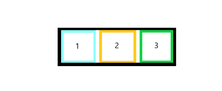
Take this box:
It represents an element on your webpage, let’s say a row, that will hold 3 <div> elements inside of it, as children. We eventually want them to line up left-to-right, on a single line, spaced out nice and evenly.
Those <div> elements, like lots of HTML, will have a default display property of block, meaning that, left-to-right, they will take up an entire line (row) on the page individually. Adding them as children to this box as is will result in something like this:
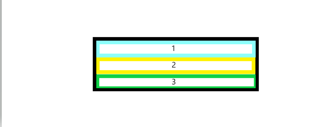
These <div> elements are each taking up the entire row! We want them to orient themselves left to right, and more so, we want to be able to move them around; rearrange them, stack them up on the left, stack them vertically, you name it!
Enter flexbox! By its very nature, when you give the CSS property of display:flex to an element, any and all immediate (that is, one level down) children of that element are automatically oriented, and moreso, designated as flex items of that parent container. This is the the container-item relationship in a nutshell. Giving the black box (the container) the css property of display:flex in above example will result in something like so:
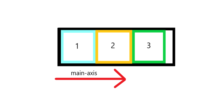
Here, we see the desired effect! By default, giving a container display property of flex will orient the child elements left-to-right, also known as a row. Another term used to describe the orientation of a container’s items is main-axis. All items will line up consecutively along the main-axis, which in this case is left to right. Other options are right-to-left, top-to-bottom, and bottom-to-top.
But what about that annoying whitespace?
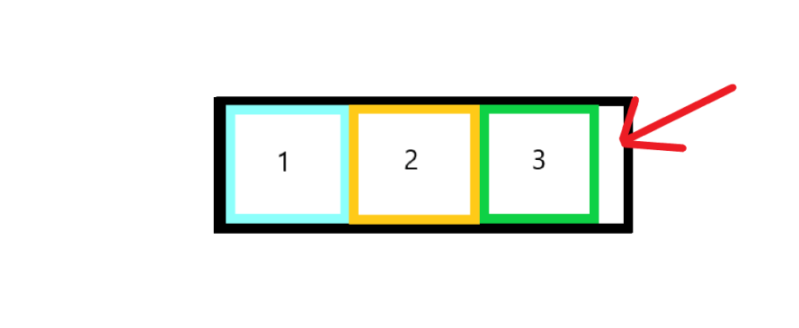
One of the many perks of using flexbox is the justify-content property. It is assigned to the parent container and determines where the flex-items are positioned inside of said container.
One such property is space-between, which fills the entire container. and spaces items evenly within it. Giving the container (the black box) these 2 CSS properties:
display:flex;
justify-content: space-between;
will result in:
Ahh… masterpiece.
To reiterate, a container is the element that has been given a display property of flex. All elements that are direct children are then deemed flex-items that can be oriented based on the container they reside in.
Give it a shot! See how the elements inside of the #container <div> align by default, and how adding the commented-out properties then change its behavior. The elements have been given fixed dimensions (height and width) to aid in the visualization process.
The Parent (container)
The parent container is where all of the high level orientation choices are made. It is where you declare, “I will keep parts of this website in you, and they will fit like so”. The example above declares a container that, by default, is a row that justifies the items within it so that they are spaced out a particular way using justify-content: space-between.
But that’s only one property! There are a ton of ways you can customize the behavior of a container. Let’s highlight them here:
Flex-direction
As stated, when you create a flex-container by assigning it to display:flex, the default main-axis is left-to-right, or row. but there are options to do so in any direction!
flex-direction: row /*(default) */
flex-direction: row-reverse /* right-to-left */
flex-direction: column /*top-to-bottom*/
flex-direction: column-reverse /*bottom-to-top */
Try it here:
justify-content
We’ve already been introduced to this one. justify-content is dependent on the flex-direction, which defines the main-axis. Let’s say the main axis is the default row, which runs left-to-right in a container. justify-content tells the container how to position the items within it. There are a lot of these, so let’s go ahead and play around with it.
Try changing the justify-content property to each of the following:
flex-start, flex-end, center, space-between, space-around, and space-evenly.
Note the slight differences in orientation between the last three.
Then, change the flex-direction to column and run through these justify-content properties again. Note how they maintain their behavior, but the main-axis has changed entirely! Now, they’re running top-to-bottom, instead of left-to-right!
flex-wrap
By default, flex-items will try to fit on one line, be it a row or a column. If the total width or height of the items within a container exceed the container’s width, items will adapt to remain within the container.
In the example below, we have a container with a width of 100px, but 3 items with a width of 50px each. This causes the items squish, no longer allowing for their full width to take hold. flex-wrap, when set to wrap, allows them to break to another line. Try it here:
flex-wrap properties:
flex-wrap: no-wrap; /*default*/
flex-wrap: wrap;
flex-wrap: wrap-reverse;
align-items
align-items serves a similar purpose to justify-content in that it deals with lining the items up, except it does so perpendicular to the main-axis, also referred to as the cross axis.
In a row, align-items will orient your flex-items along the vertical (or y) axis. Use it in conjunction with justify-content to orient the items in your container.
The properties are similar to those of justify-content, but some go by slightly different terms. The properties are:
flex-start, flex-end, center, stretch (default), and baseline.
Try them here:
align-content
align-contentis a bit of a misnomer, as the property that parallelsjustify-contentis morealign-items.
align-content, rather, serves to orient the lines of items within a flex-container. If there is only one line, say an individual row or column, align-content will have no effect.
See here, when the container is just too small for the items to exist in one row:
We have set the container to wrap, so the third item exists on a second row. Now, because we have multiple rows, align-content will effectively orient them.
Replace align-content with the following properties to see how they behave:
flex-start, flex-end, center, space-between, space-around, space-evenly, stretch (default).
The Children (items)
The child elements, or items, are not focused on the overall layout as the container is. In fact, they have their own properties separate from those already discussed that deal with how an individual item is laid out inside that container.
items can change adjust position outside of the natural flow of what a container might want! They can also be given sizes relative to their sibling items, aligned separately, and even change the order they appear in a flex-container!
order
By default, an item in a flex-container appears in the same order as it does in the source HTML. That value defaults to 0 for all items, but can be overridden by giving a value to it greater (or less) than the default. This will change the order of the items!
flex-grow and flex-shrink
When assigning a flex-grow or flex-shrink value to an element, it tells that element to scale (or change size) relative to the number given. The default value is 0, so any number greater than that will establish a ratio between it and the other items next to it.
align-self
align-self allows an individual item to change its alignment regardless of the parent container’s align-items property. This allows items to “break rank” so to speak. They will still exist within the normal flow of a flex-container.
align-self posesses the same values as align-items, but applies to the individual item and not the container.
Those values are:
flex-start, flex-end, center, stretch (default), and baseline.
Try it out:
Final Musings

Flexbox allows for a highly customizable, scalable design pattern that leaves much of the internal calculations (like width, and ratio) up to its core functionality. With it, you can spend less time micromanaging your own code and more time building beautiful and dynamic webpages!
Some final takeaways:
- Containers are created with
display:flex - A container only treats immediate children as flex-items
- Containers have a main axis in which flex-items are justified with
justify-content - A container’s main-axis is dependent on the
flex-directionand defaults torow align-itemsorients the flex-container’s contents along the cross-axis.- flex-items are the children of the flex-container
- flex-items have properties that are available to them only as children to a flex-container, like
order, and whether they willgroworshrink.
Happy Coding :)
-Paul